from IPython.display import HTML

HTML('''<script>
code_show=true;
function code_toggle() {
 if (code_show){
 $('div.input').hide();
 $('div.output_stderr').hide();
 } else {
 $('div.input').show();
 $('div.output_stderr').show();
 }
 code_show = !code_show
}
$( document ).ready(code_toggle);
</script>
<form action='javascript:code_toggle()'><input STYLE='color: #4286f4'
type='submit' value='Click here to toggle on/off the raw code.'></form>''')
Machine Learning on EEG signal 
Disclaimer: This project is under construction, latest refresh was on 16/12/19.
Disclaimer 2: The project contains code cells also, so if you want see the code cells, consider toggling them at the top of the document.
Introduction
The goal of this project is to familiarize myself with the use of machine learning in electroencephalographic signals. This project was originally made for the Data Mining in Physics course but I plan to work on it later also. Methods used here are more or less very rudimentary, most of them are only to show different aspects.
My topic is about somehow applying machine learning and data mining methods on EEG data. Since I have a lot of data and different measures, my main goal is to find such a method that can either group these measures or at least validate the theories we already have.
Experimental Background
Mismatch negativity is a well-known phenomena that is present in the brain when a deviant signal is present after many standard has been shown. By somewhat trying to learn the incoming signal and/or predicting it, the local connections (rather neural activities) form in such a way that the measures EEG signal drops down i.e. the brain gets used tothe same input.
Let us say, the brain gets used to stimulus A, and after a lot of A (>20 but may vary) we present stimulus B. The response we get is not the same as if we just randomly shuffled the responses (equiprobable experiment). Two main ideas lay beneath the surface; first that the difference comes from the fact that the received signal is not the same as the predicted one, second is that when processing the signal other areas of the brain may join into the decomposition i.e. we do not measure the same population of neurons.
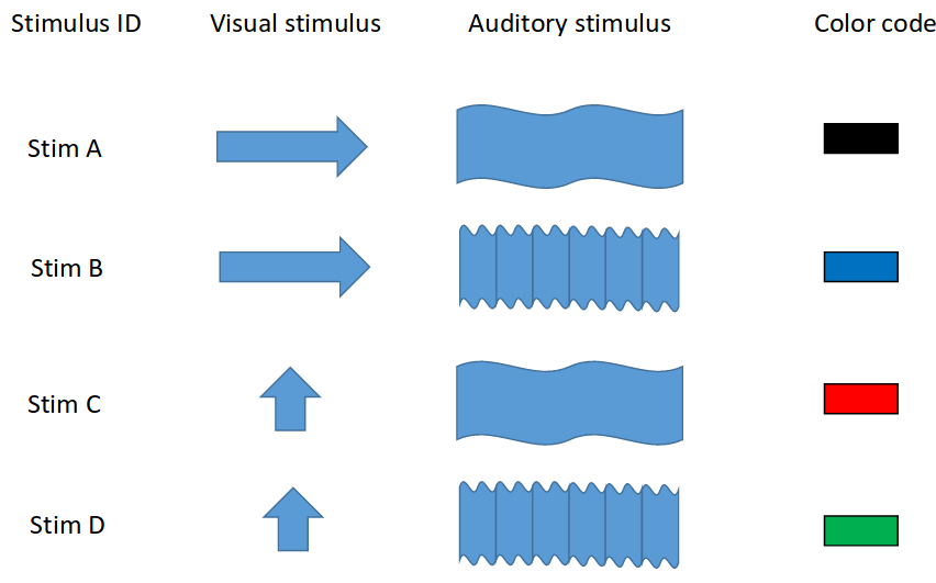
However, in our case we have two types of stimulus: visual and auditory. This setupallows us to measure whether conditional mismatch negativity exists. Combining the two types of stimulus with the two kinds (horizontal or vertical grating to the eyes and low or high pitch noise to the ears) gives us all in all 4 types of stimulus, let us call them A-D. From this one can identify the mismatches: only visual, only auditory or bimodal. A short summary can be seen below.
The experiment has been done many times, both on anaesthetized and awake mice, data was acquired in the visual and auditory cortices of the brain by Holland biologists. During my job I always worked on only one anaesthetized mouse, but I can access the data easily if needed. For the main experiment the stimulus lasted for 500 ms with 1.5 sec of ITI (inter-time interval). One session (when one was the standard) meant approximately 600 stimulus with a $32kHz$ of sampling frequency, all in all I have the access to nearly a terabyte of raw EEG data.
Goals
As it was mentioned in the introduction data clustering can be useful and maybe dimension reduction. For the latter TSNE and UMAP are available, yet, I have no precise idea about the former but maybe Andrew NG’s publications (which was mentioned by Bálint) might help – use of ML in neurology. All the results I have so far can be tested both bysupervised and unsupervised learning, both in time and frequency domain.
# importing all the necessary stuff
import pandas as pd
import numpy as np
import matplotlib.pyplot as plt
import matplotlib as mpl
import matplotlib.patches as mpatches
import time
import sys
import pickle
import mne
from scipy import signal
from mne.time_frequency.tfr import morlet
import umap
from sklearn.decomposition import PCA, NMF
from sklearn.manifold import MDS, TSNE
from sklearn.cluster import KMeans
from ncs_class import color_dict_ds as colordict
# my particular package that helps converting
# raw EEG data from many .ncs files into a
# hands-on object
from coh_creation import Area
sys.path.insert(0, '/home/kfuruglyas/Documents/hbp/furu')
Since we are talking about large files, here I am only going to load in one epoch, where the A stimulus was the standard (10 ms after the beginning and before the end to avoid the on/off effects). This means that there are way more stimulus from type A. The following lines are showing the cardinality of each one.
areaA = Area("A_standard", win = [10, 490])
total = 0
for k in areaA.signals.keys():
    total += len(areaA.signals[k].keys())
    print(f"There are {len(areaA.signals[k].keys())} trials for {k}.")
print(f"There are {total} trials all in all.")
Below you can see an arbitrary response from a given channel. This is just the presentation that these are valid signals.
rand_channel = 0
plt.figure(figsize=(10,6))
plt.plot(np.linspace(10, 490, len(areaA.signals["STIM_b"][3698088461][rand_channel])),areaA.signals["STIM_b"][3698088461][rand_channel])
plt.xlabel("Time [ms]")
plt.ylabel("Voltage [$\mu V$]")
plt.grid()
plt.title(f"An arbitrary response from channel {rand_channel} \n for B stimulus whilst A was the standard (auditory mismatch) ");

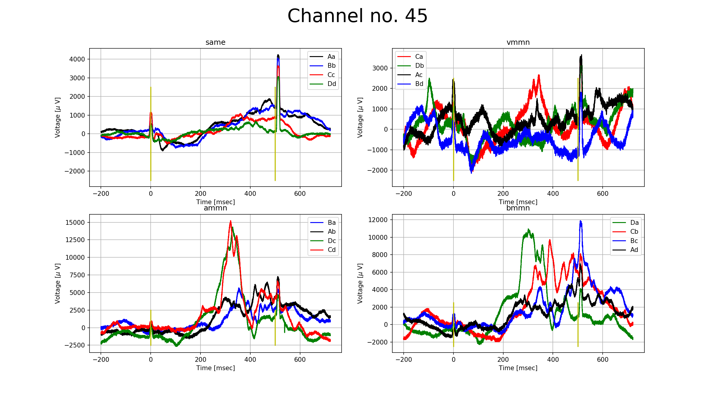
To prove that there is an undelying phenomenon going on, please take a look at the figure below. The figure show a channel (number 45) from the auditory cortex. The subplots are based on the types of mismatches negativities (no mismatch, visual, auditory, bimodal). The lines on one subplot mean the relation of the standard and the deviant stimulus, for example, on the auditory mismatch negativity's ($\textsf{ammn}$) subplot the $\texttt{Ba}$ means that the response for the signals that were averaged was A, but many signals before that had been the stimulus B. The number of signals that were averaged are around 20, except for the no mismatch subplot, where there were more than 400. All subplots show total zero nowhere, therefore we can assume that the averaged signals can be somehow grouped into one. Furthermore, there is a new phenomena called $\textit{conditional mismatch negativity}$, which can be seen on the subplot $\textsf{ammn}$. The responses $\textsf{Cd}$ and $\textsf{Dc}$ showed a significantly higher response than $\textsf{Ab}$ and $\textsf{Ba}$ between 200 and 400 ms. $\textsf{A}$ and $\textsf{B}$ stimuluses were visually horizontally grating whilts $\textsf{C}$ and $\textsf{D}$ were vertically.
Frequency domain
Analyzing the signal in time domain is costly, therefore the Fourier representation of the signal is more convenient. Furthermore, even though the sampling frequency was $32 kHz$, we do not need frequencies above $1kHz$ for biological reasons.
# this creates the connectivities
# which we will use later
# & the frequency resolution
areaA.run_mne(verbose=False);
# This code cell (slowly but surely) computes the Fourier
# transform for all the signals

spectras_2 = {}

cnt = 0
t = time.time()
upload = {}
for stim, v in areaA.signals.items():
    print(f"{stim}")
    for c,ts in enumerate(v.keys()):
        for c2, ch in enumerate(v[ts].keys()):
            #print(f"in ts-s: {100*(c+1)/len(v.keys())},  time = {time.time()-t}", end = '\r')
            fou = np.fft.rfft(v[ts][ch])[:len(areaA.freq_resolution)]
            for freq, amp in zip(areaA.freq_resolution,fou):
                upload[freq] = amp
            upload["STIM"] = stim[-1]
            upload["ch"] = ch
            upload["ts"] = ts
            #df = df.append(upload, ignore_index=True)
            spectras_2[cnt]=upload.copy()
            cnt+=1
            upload.clear();
reter = pd.DataFrame.from_dict(spectras_2).T
reter["color"] = [colordict.get("STIM_"+w) for w in reter.STIM]
reter["area_color"] = ['blue' if w<32 else 'red'  for w in reter.ch]

# cheatsheet:

# http://queirozf.com/entries/one-hot-encoding-a-feature-on-a-pandas-dataframe-an-example
# https://docs.python.org/3/howto/sorting.html
# https://stackoverflow.com/questions/33990495/delete-a-column-in-a-pandas-dataframe-if-its-sum-is-less-than-x


to_clear = ['STIM']

dropcol_below, dropcol_above = 11, 1000

dropfreqs = []
for col in reter.columns.drop(["color", 'ch', 'STIM', 'ts', 'area_color']):
    if not (dropcol_below < col < dropcol_above):
        dropfreqs.append(col)


df_freq_rem = reter.drop(dropfreqs, axis = 1)

for thing in to_clear:
    df_var = pd.get_dummies(df_freq_rem[thing], prefix=thing)
    df_freq_rem = pd.concat([df_freq_rem,df_var, ],axis=1).drop([thing],axis=1)

todrop = ['color', 'ch', 'STIM_a', 'STIM_b', 'STIM_c', 'STIM_d', 'ts', 'area_color']
for col in df_freq_rem.columns.drop(todrop):
    df_freq_rem[col] = abs(df_freq_rem[col])
The resulting dataframe consist all the incoming signal from all the channels (64) for all the trial (485), therefore having $64\cdot485 = 31040$ rows. The coloumns are mostly the amplitudes for the given frequency, for the stimulus I already created a dummy table, we have a channel number (ch) a timestamp (ts) and two colors; one for the stimulus type, the other for the place in the brain (auditory (red) or visual (blue) cortex). Since low frequencies cannot be measured exactly (see warning message above), I am thresholding them at $11 Hz$.
print(f"The shape of the dataframe: {df_freq_rem.shape}.")
df_freq_rem.head()
With having this in hands, it is obvious that we need some dimension reduction, so maybe with that we can somewhat distinguish the signals.
First, lets look at some channels and try to reduce their dimensionality with TSNE and UMAP. I am going to drop all the known information about the signals i.e. I will only use the frequency bands. Below I colored the plots by their stimulus types. Norming is done only on one channel, by the ordinary norming ((data-mean)/std).
for chan in [0,15,30,45, 60]:
    todrop = ["color", 'ch', 'STIM_a', 'STIM_b', 'STIM_c', 'STIM_d' , 'ts', 'area_color']

    data_norm = (df_freq_rem[df_freq_rem.ch==chan].drop(todrop, axis = 1) - df_freq_rem[df_freq_rem.ch==chan].drop(todrop, axis = 1).mean()) / df_freq_rem[df_freq_rem.ch==chan].drop(todrop, axis = 1).std()
    #data_norm = (df_freq_rem[df_freq_rem.ch==chan].drop(todrop, axis = 1) - df_freq_rem[df_freq_rem.ch==chan].drop(todrop, axis = 1).mean(axis = 1)) / df_freq_rem[df_freq_rem.ch==chan].drop(todrop, axis = 1).std(axis = 1)

    #data_emb = TSNE().fit_transform(df_freq_rem[df_freq_rem.ch==0].drop(["color", 'ch', 'STIM_a', 'STIM_b', 'STIM_c', 'STIM_d' ], axis = 1))
    data_emb = TSNE().fit_transform(data_norm)

    black = mpatches.Patch(color='black', label='STIM_a')
    blue = mpatches.Patch(color='blue', label='STIM_b')
    red = mpatches.Patch(color='red', label='STIM_c')
    green = mpatches.Patch(color='green', label='STIM_d')


    plt.figure(figsize=(16,8))
    ax1 = plt.subplot(121)
    ax1.set_title(f"TSNE embedding for ch: {chan}")
    ax1.set_xlabel("First dim")
    ax1.set_ylabel("Second dim")
    ax1.scatter(data_emb[:, 0], data_emb[:, 1], c = df_freq_rem[df_freq_rem.ch==chan].color)
    ax1.legend(handles=[black, blue, red, green], loc = 'best')
    ax1.grid()

    embedding = umap.UMAP().fit_transform(data_norm)
    ax2 = plt.subplot(122)
    ax2.scatter(embedding[:, 0],embedding[:, 1], c = df_freq_rem[df_freq_rem.ch==chan].color)
    ax2.set_title(f'UMAP embedding for ch: {chan}')
    ax2.grid()
    ax2.set_xlabel("First dim")
    ax2.set_ylabel("Second dim")
    ax2.legend(handles=[black, blue, red, green], loc = 'best')
    plt.show()


As it is clearly seen, no real distinction can be made, unfortunately. Otherwise, it would have been an easy task. For the next step I grouped them by having the same stimulus (except for STIM_a) and tried to find whether the channel places can be found (auditory or visual). Norming here was done by all the channels but for one stim.
for sti in [ 'STIM_b', 'STIM_c', 'STIM_d']:
    data_norm = (df_freq_rem[df_freq_rem[sti]==1].drop(todrop, axis = 1) - df_freq_rem[df_freq_rem[sti]==1].drop(todrop, axis = 1).mean()) / df_freq_rem[df_freq_rem[sti]==1].drop(todrop, axis = 1).std()
    #data_norm = (df_freq_rem[df_freq_rem.ch==chan].drop(todrop, axis = 1) - df_freq_rem[df_freq_rem.ch==chan].drop(todrop, axis = 1).mean(axis = 1)) / df_freq_rem[df_freq_rem.ch==chan].drop(todrop, axis = 1).std(axis = 1)

    #data_emb = TSNE().fit_transform(df_freq_rem[df_freq_rem.ch==0].drop(["color", 'ch', 'STIM_a', 'STIM_b', 'STIM_c', 'STIM_d' ], axis = 1))
    data_emb = TSNE().fit_transform(data_norm)

    blue = mpatches.Patch(color='blue', label='Visual')
    red = mpatches.Patch(color='red', label='Auditory')


    plt.figure(figsize=(16,8))
    ax1 = plt.subplot(121)
    ax1.set_title(f"TSNE embedding for {sti}")
    ax1.set_xlabel("First dim")
    ax1.set_ylabel("Second dim")
    ax1.scatter(data_emb[:, 0], data_emb[:, 1], c = df_freq_rem[df_freq_rem.STIM_b==1].area_color)
    ax1.legend(handles=[blue, red], loc = 'best')
    ax1.grid()

    embedding = umap.UMAP().fit_transform(data_norm)
    ax2 = plt.subplot(122)
    ax2.scatter(embedding[:, 0],embedding[:, 1], c = df_freq_rem[df_freq_rem.STIM_b==1].area_color)
    ax2.set_title(f'UMAP embedding for {sti}')
    ax2.grid()
    ax2.set_xlabel("First dim")
    ax2.set_ylabel("Second dim")
    ax2.legend(handles=[ blue, red], loc = 'best')
    plt.show()


Thank God, it did separate the signals more or less based on the placement of the sensor. I did not run the methods for the STIM_a since that is costly again. I will do that however. The next task is to recognize wheter the images above do reflect the channels also (there are 64 channels, and approximately 20 deviant stimuli for each trial, so all in all $\sim 1280$ points on each plot) i.e. color them by the channel number or use KMeans to group 64 clusters.
Conclusions (so far)
The separations by stimuluses did not end well, but it did when I grouped them by channels. The key must be hidden in the normalization, I do believe. Further improvements will be (not can be, since I will use these in the future) :
- KMeans on the separation by areas,
- Linear and Logistic regression for the channels,
- by wavelet transform, use some image recognition algorithm for supervised learning (optional).
Furthermore, I will send in a proper pdf file, but as you can see below, I could not make it work to produce a proper wavelet (tbh, I could not understand how the built-in functions worked), which I had started my whole work with.
Latest modification: 16/12/19.
Trial & Errors
This section is the remaining of the trails that went vakvágányra wrong. Mainly about wavelet transform.
plt.semilogy(areaA.freq_resolution,areaA.fft_spectra['STIM_b'][1])

from scipy import signal


widths = np.arange(1, 320)
cwtmatr = signal.cwt(areaA.signals["STIM_b"][3698088461][0], signal.ricker, widths)
plt.imshow(cwtmatr, extent=[10, 490, 1, 320], aspect='auto',
           vmax=abs(cwtmatr).max(), vmin=-abs(cwtmatr).max())
plt.colorbar()
plt.show()

cwtmatr.shape
import pywt
r = pywt.wavedec(areaA.signals["STIM_b"][3698088461][0], 'bior1.3')
for i in r:
    plt.plot(abs(i), "o")

plt.plot(r,t, 'o')

plt.plot(abs(np.fft.rfft(y)))

>>> coef, freqs=pywt.cwt(areaA.signals["STIM_b"][3698088461][0],np.arange(1,129),'gaus1', sampling_period=1/(32*2*3.1415926))
>>> plt.matshow(coef, aspect='auto') # doctest: +SKIP
>>> plt.show() # doctest: +SKIP
